nikf:
In the five years that I’ve used a Mac, I’ve had two browsers of choice: Camino, and then with Safari 3’s arrival Safari. I know that folks swear by Firefox, but I don’t - and typically find myself swearing at Firefox. Whilst the Mozilla folks have done a fine job of making it look like a Mac app, it never seems for feel and behave like a Mac application. Part of my Safari preference is that I also have a teeny bit of a crush for WebKit, the engine that powers Safari with its CSS animations and long-supported (much clichéd) rounded corners.
In a quick trawl through my Applications folder last weekend, I happened to come across a rather old Chrome OS X Developer Preview that I’d downloaded and promptly forgotten about. Purely out of curiosity I ran it, made sure it was up to date, and started using it.
I haven’t stopped since.
Some Observations
- It’s fast. Lightning fast - I thought Safari was snappy (and compared to Firefox and Camino, it is) but Chrome is screaming in comparison.
- Top tabs - I was probably in the minority to mourn their demise in the final Safari 4 release, but it’s great to have them back. The behaviour of Chrome’s “Open in New Tab” option is also fantastic: when opening links in a new tab, the tab opens alongside the existing tab you’re working in. Safari adds tabs after the right-most tab, whereas Chrome’s option groups the links together, easily allowing you to return to your original tab.
- It’s super-stable - it’s not crashed or hung on me in a week - and it’s still not entered Beta. Take that, Safari.
- The combined search / address field - I find myself still hitting Tab, expecting it to focus a search box, but another few days use should cure that.
- It’s WebKit - enough said.
The bit where I whinge about some minor issue
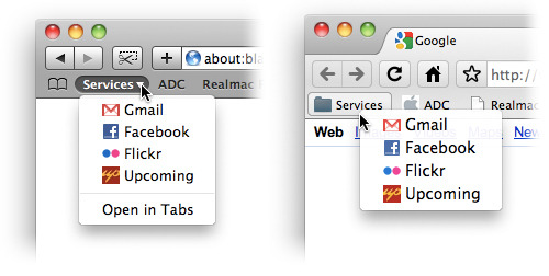
Whilst Chrome looks and feels like a Mac application, there’s one striking annoyance that irritates me: the behaviour when you click on a Folder in the Bookmark bar. In any other browser, it behaves as an OS X menu should. That is, no matter where you click the item, the menu should appear in a fixed location, below the menu item in question. OS X’s default contextual menus appear directly below and to the right of the area you click.
As it stands right now - and shown in the above comparison - Chrome’s bookmark folders behave like a contextual menu (despite also having their own contextual menus), and it’s driving me a little crazy. Yes, Chrome remains in Pre-Beta - and these things can change - but it’s details like this that make or break whether an application feels like a Mac application. Never mind if an app’s got aqua buttons, a sexy HUD or any other aesthetic beauty. It’s all about how an application behaves.
If you’re wanting to give Chrome a go, it’s available from the Chrome Developer Channel. It’s still pre-beta, however in my experience it seems to be more relating to its feature-incomplete state than anything else. I’ve been using the Chrome Preview non-stop for the past week, and you’ll have to pry it out of my cold, dead hands.